Blog
 Sonya
SonyaAs more people use their phones for online shopping, providing a responsive user experience is more critical than ever. In today’s mobile-first world, optimizing your website for various devices isn't just a bonus—it's a necessity. One key feature that can enhance the user experience on your e-commerce site is displaying different image banners based on the device being used. Different devices have different screen sizes, resolutions, and user interactions. By tailoring your image banners for specific devices, you create a seamless and engaging experience, which can lead to higher engagement rates and increased conversions. This approach keeps your site visually appealing and functional, whether your visitors are using a mobile phone, tablet, or desktop.
In addition, using different image sizes for different screens can improve your site's performance, especially on mobile devices, as smaller images load faster. This not only enhances the overall user experience but also contributes to better site performance.
In this blog, we’ll walk you through the steps to show different image banners on different devices for the Dawn theme in Shopify.
Steps to Add Device-Specific Image Banners
Before making any code modifications, always ensure you create a copy of the theme first. Test all your changes on this copy to confirm everything works perfectly before publishing it to the live theme. This precaution helps prevent any issues from affecting your main theme and keeps your work safe.
Add Two Image Banner Sections to Your Homepage
First, you'll need to add two image banner sections to your homepage. This allows you to create and customize banners specifically designed for desktop and mobile views.
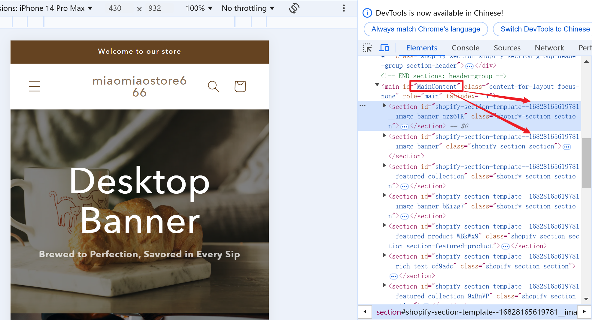
Preview the Theme and Note the Section IDs
Next, preview your theme and make a note of the section IDs. The section IDs are unique identifiers for each section in your theme, and you'll need them to specify which banners should be shown on which devices.
Edit Your theme.liquid File
Now, open your theme.liquid file. This file controls the overall layout and structure of your theme. Scroll to the bottom of the file and add the following code snippet. Ensure you replace your_section_id with the actual section IDs you noted earlier.
<style>
@media screen and (min-width: 751px) {
#shopify-section-template--23119250981154__image_banner {
display: none
}
}
@media screen and (max-width: 750px) {
#shopify-section-template--23119250981154__image_banner_PJ3nfy {
display: none
}
}
</style>Note: It's crucial to replace your_section_id_desktop and your_section_id_mobile with the corresponding section IDs for your desktop and mobile banners.
By following these steps, you can enhance your e-commerce site’s responsiveness and visual appeal, ensuring that your customers enjoy a seamless browsing experience regardless of the device they use. This small tweak can make a big difference in user satisfaction and engagement, ultimately driving more conversions and sales for your online store.
For any questions or further assistance, please don't hesitate to reach out. Simply leave us a message, and we will respond to you as soon as possible. We're here to help and look forward to working with you!